At LogicGate, we are always striving to be better. As we continue introducing new features, we also seek to make our app accessible for all users. Can people complete records using only a keyboard? Are images and button contexts read aloud to screen readers? As a team, we recently began asking similar questions and saw room for improvement. If we test across a range of browsers, we should also cater to a range of users. This year, we began a new accessibility initiative and have learned tremendously in the process.
Where to Begin?
With forms, notifications, reporting, and more, it’s tricky to know what to tackle first when auditing the platform. That said, we identified a couple things to help us get started with an audit.
1. Start Small
Let’s start with the most trafficked page. Our records page has the most users completing fields and assigning tasks. Instead of spreading efforts across the entire site, we can learn more efficiently if we improve one part of the app then expand our scope as we triage.
2. What tools should we use?
There are countless accessibility tools, but a few we used throughout our efforts. From the Lighthouse tool built directly into Chrome’s DevTools, to the “Tab Stops” feature of Microsoft Accessibility Insights, each tool has interesting yet distinct features.
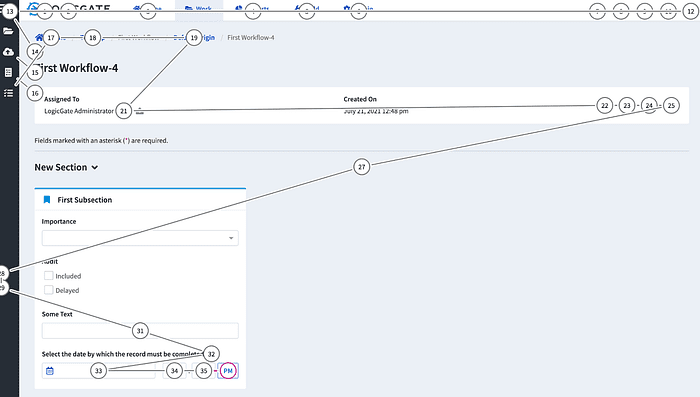
We adopted WebAIM’s WAVE tool as our standard for accessibility audits. WAVE has a Chrome and Firefox extension to scan a page immediately. The tool also works without initiating a refresh, providing feedback for modals or other visuals that must be triggered with a button click.
3. Tools won’t tell us everything
Accessibility tools are amazing, but they aren’t a catch-all. An aria-label can sometimes be more descriptive or succinct, and it’s easy to overlook notifications or expanding sections that may go unannounced when a page changes states.
What do we Attack First?
After the first few audits, we began seeing three easy-to-fix errors that frequently surfaced.
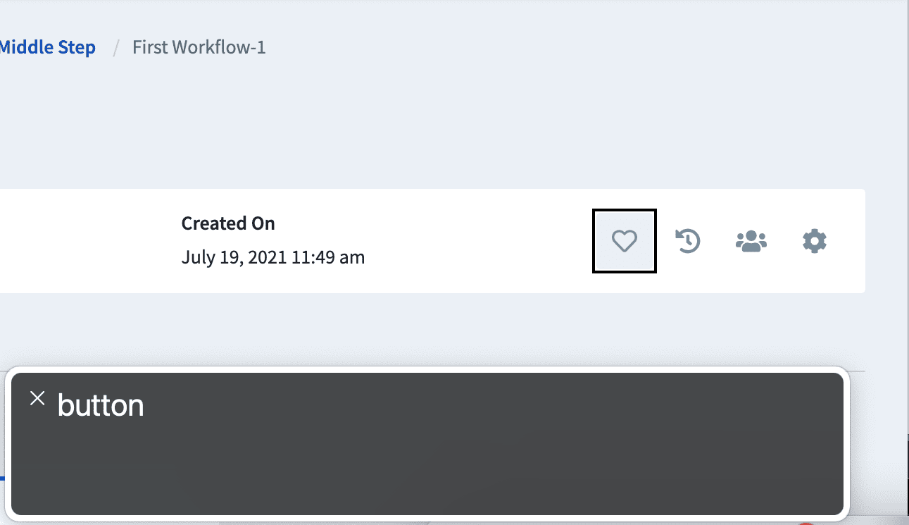
1. Using aria-label
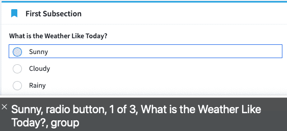
2. Fixing orphan labels
3. Color contrast
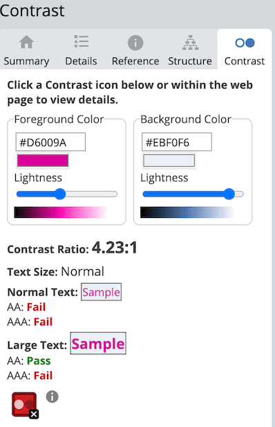
We recently decided to remove placeholder text from text inputs as they are often the source of color contrast warnings. Instead, we began placing descriptive labels above inputs to guide visitors.
Keeping dependencies up-to-date can also result in accessibility improvements. On the frontend, we use Ng Bootstrap to provide Angular widgets. With each version bump, Ng Bootstrap often introduces accessibility improvements and fixes. Keeping these dependencies up-to-date is a good idea to stay on top of third-party patches.
How do we Know We’re Helping?
As developers, we must ask questions when reviewing new features.
Is the feature keyboard accessible?
- Can we focus on interactive elements using the tab key?
- Is there a visual indicator making it clear which item has focus?
- Can we interact with elements using common keys (enter, space, arrow keys, etc.)?

Does the feature account for screen readers?
- Does the element take advantage of aria attributes?
- Are state changes announced when an element is toggled or changes states?
Ex: Consider using aria-live="polite" for notifications that appear on screen and are important to announce to a user.
These are just a couple questions to ask in addition to running a tool like WAVE to check for regressions. However, for all of our planning and auditing, we learn most by asking questions and engaging the wider accessibility community.
We’ve found a wealth of knowledge from podcasts such as A11y Rules by Nicolas Steenhout and Mosen at Large by Jonathan Mosen . We follow Deque Systems, who frequently host A11y workshops and conferences. The Deque community is incredibly robust, tremendously helpful, and constantly evolving. We also chat with our stakeholders and clients who help determine ways to improve our app. We do not have all the answers but continue to learn through constant conversation.
What’s Next?
As we expand the scope of our audit, we continue to evolve. We remain reflective in finding creative solutions that benefit everyone taking part in the Risk Cloud. We found that a recent feature we added to improve accessibility provided unnecessary tab stops for visitors, so we questioned our process, readdressed the problem, and found a solution that improves accessibility while removing needless tabs.
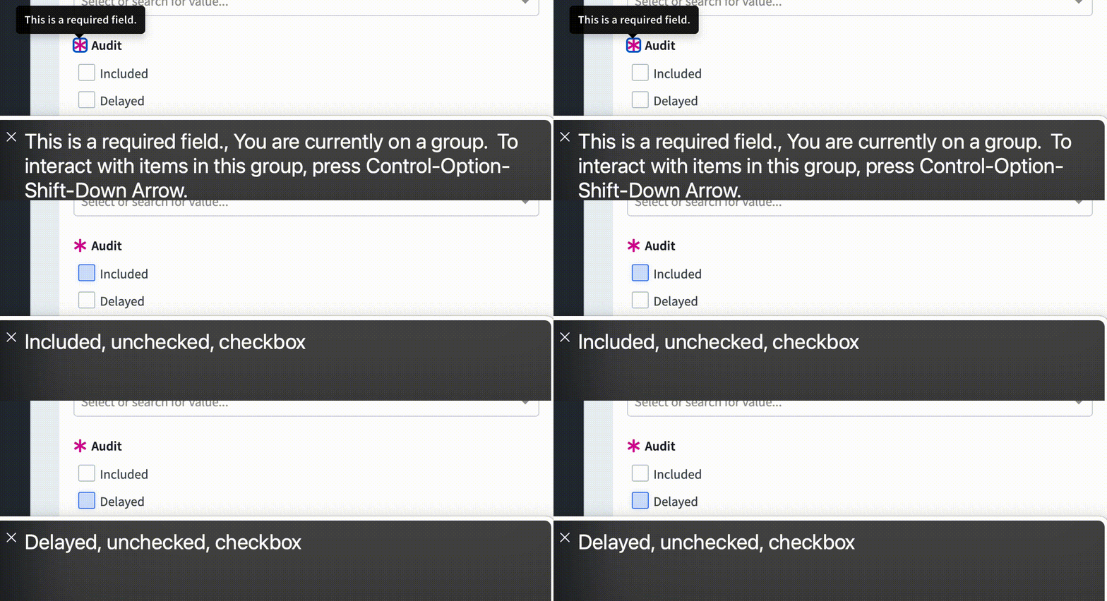
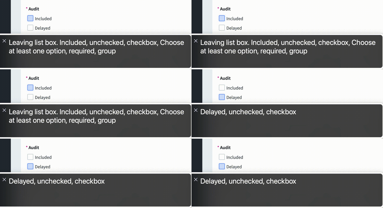
We hope to apply the skills we’ve learned through an initial audit to further refine the rest of the app and new tools we introduce. As a team, we share ideas between developers, designers, and the larger LogicGate community to keep a critical eye on our process and continually improve the platform.